·
11 minute read
·
11 minute read

In today’s digital-focused world, having a website isn’t an option – it’s a necessity. But it’s not enough to have just any website. You need one that will be a positive face for your company, meet the needs of your target audience, generate leads and turn those leads into paying customers.
No pressure.
Although every company has different goals and needs, there are some best practices to follow when updating, redesigning or launching a website that will help you improve the overall user experience so you can generate more leads for your business.
Let’s get started.
1. Focus on your target audience
It can be easy to get caught up creating the best design for your website that you forget about the end user and what they’re looking for when they visit your site. So, I’m going to be honest with you for a second: Your website isn’t about you. It’s about your audience.
The best websites don’t just have the most attractive designs and features. Instead, they’re designed to attract your target audience—which you can identify using buyer personas—and give them the information they need and move them through the buyer’s journey.
Don’t get me wrong. Design is important, and a poorly designed website will probably be a turn-off to visitors. But don’t get so caught up in designing the flashiest, trendiest website that you lose sight of what your audience needs, the questions they have and what information will convert them from visitor to lead to customer.
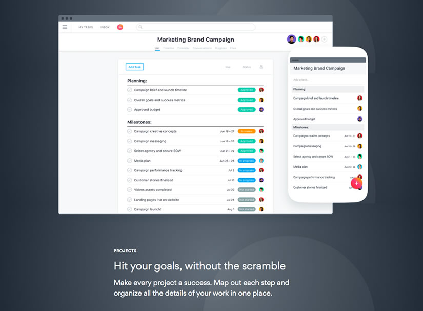
Let’s take Asana, for example. They know exactly what businesses are looking for in a project management tool, and they make sure their product page hits on the major pain points and how their product solves these challenges.
2. Choose the right template or theme
Whether you’re customizing a pre-made template or creating one from scratch, choosing the right design for your website is important.
Explore design and theme options that evoke warmth and an emotional response from your audience. It may sound silly, but what users feel when visiting your website is important. If your site is full of stuffy stock photos, basic icons or too many dark colors, visitors may not get the feeling you’re the right company to partner with.
Instead, use light, bright colors (when appropriate for your brand), photos that represent your target audience and other images that reflect who you are and what you do.
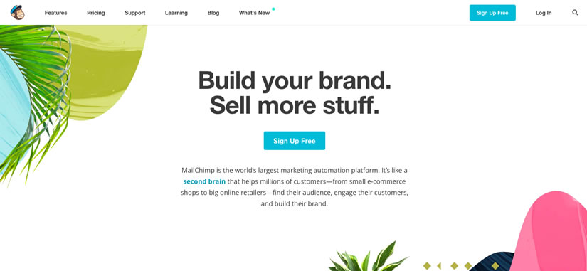
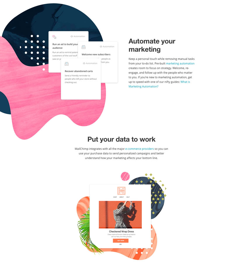
A great example of a brand that does this well is MailChimp. Not only does MailChimp do an excellent job at understanding their audience, their website is warm, bright, inviting, open and super easy to use.
3. Keep the design consistent
This may sound obvious, but every page on your website should be cohesive and look like it comes from one company. While your services page design will likely differ from your blog layout, each template should have similar styling and fit together seamlessly.
Some ways to do this include:
- Keeping the size, style and color of your buttons/CTAs consistent throughout the site
- Making sure your font sizes for body copy and headings remain the same on every page
- Sticking to a color scheme that matches your brand
- Using similar typography throughout your website
- Keeping the format of your page titles consistent (either use "–" or "|" but not both)
Going back to MailChimp, if you look at their home page (or any of their pages, for that matter), the font sizes for headers and body copy are consistent. They use the same CTA style and color throughout the site. The link color remains the same. There’s a common theme that flows throughout the site, and no matter what page you’re on, it’s consistent with the MailChimp brand.
4. Add trust through testimonials and case studies
As visitors move through the buyer’s journey, they’ll start doing more research about potential solutions and vendors – and they’ll turn to your website to get to know you better. Understandably, though, they may be hesitant to trust you right away.
To gain their trust, let your customers do the talking.
Show how your product or service benefits your target audience by adding testimonials, case studies and quotes to your website. A case study or testimonials page – along with customer quotes on your home page – is a powerful tool for establishing trust and encouraging prospects to take the next step.
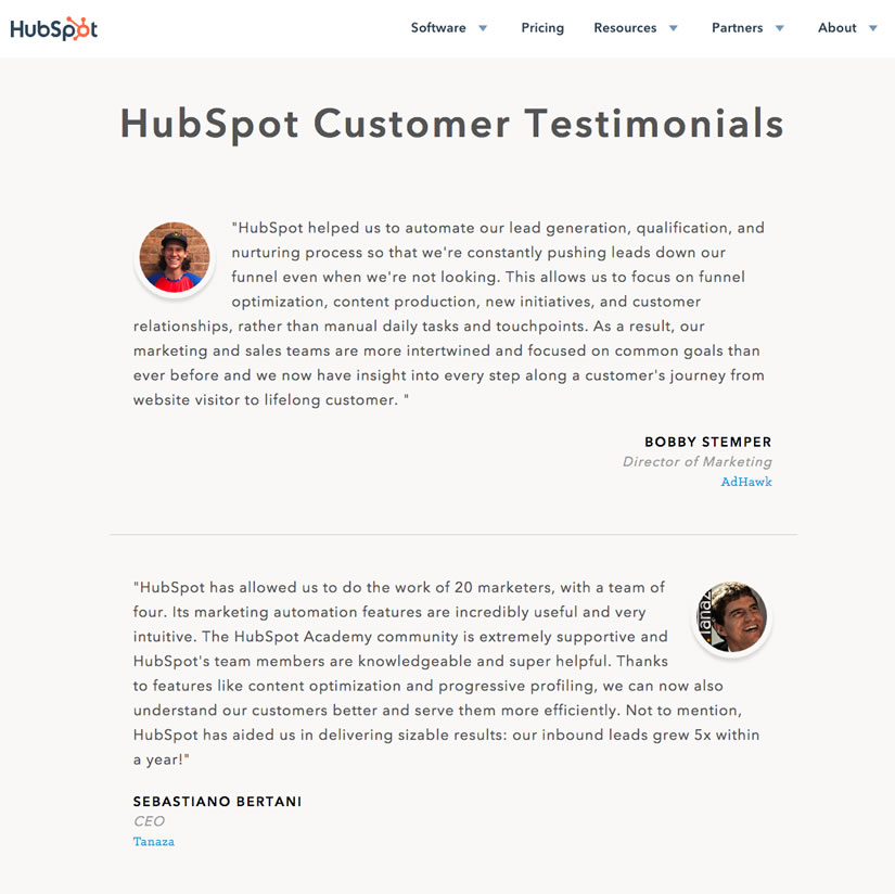
There are several different ways to add case studies to your website. For example, HubSpot has an entire website page dedicated to customer testimonials.
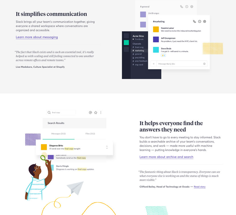
Slack, on the other hand, incorporates customer quotes into their features page. It may not look as impressive as HubSpot’s testimonial page, but it’s still a powerful way for Slack to demonstrate how their product’s features have solved real problems for real clients.
5. Conduct user experience testing
As you design your website, you should focus on creating the best possible experience for your visitors. Your website should be easy to navigate, the messaging should be clear and useful (more on this later), and your site should help gain the trust of potential customers.
But how do you know if your website meets these goals? And what separates a good user experience from a bad one?
You could ask around the office to see what your coworkers think, but naturally, some bias will exist if you’re only talking to people within your company. Instead, conduct user experience testing to get helpful and actionable feedback.
User experience testing – also known as UX testing, usability testing and user testing – allows you to get feedback on your website, ideally from your target audience. It’s an effective way to learn what’s working, what’s not and how you can improve your overall website experience.
There are several different ways you can approach UX testing, including:
- In-person, contextual user research and usability testing. This is the best way to identify pain points and find opportunities to improve the design, enhance the user experience, increase conversions and improve messaging.
- Basic research through surveys or automated user research tools (like userinput.io). Using these methods may provide limited insight and can lack the depth of insight gained through direct contextual research. However, using an automated research tool can provide quite a bit of helpful feedback, and it’s a great resource for businesses who don’t have the time or resources for in-person testing.
- Heuristics. Making educated guesses or using your best judgment isn’t ideal, but it’s great for identifying low-hanging fruit and quick wins.
- Informed stakeholder opinions. Talking to stakeholders – like company executives or even clients – is better than nothing, but the feedback you’ll receive is often too biased.
6. Make sure your content is clear
When someone visits your website – whether it’s the home page or a product/services page – it should be clear who you are and what you do. Avoid using industry jargon, and eliminate words and phrases that make it more difficult for your audience to understand what you’re talking about.
This is where usability testing can be incredibly valuable. If someone who’s never heard of you comes to your website and doesn’t immediately know what you do, you may want to rethink your messaging and how you approach your content.
When writing content, remember to focus on your buyer personas. Address their pain points, answer their questions and show how your company can provide the best solution to their problem.
Related Content: The 8 Mistakes You're Making With Your Buyer Personas
7. Get visitors to take action
Think about your website in its current state. Does each page guide visitors to take the next step? Have you created landing pages for your content offers? Does every page have a call-to-action? Are all your leads added to a contact database?
If you want a true lead generation website, you need ways to turn your visitors into leads. To do this, add the following elements to your website:
- Lead generation forms: Forms are a critical piece of your lead generation efforts. Without forms, you won’t be able to get contact information that your site visitors actually opt in to give you. And the “opting in” part is important. When people willingly hand over their contact information by filling out a form, they’re actively showing interest in your product, service or business.
Although landing pages are the most popular place to put lead generation forms, you can add them to other pages of your site including the home page, contact page or even product/service pages.
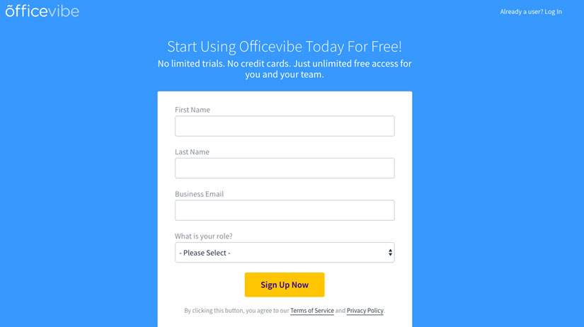
Let’s look at two examples. Officevibe takes a traditional approach by putting their sign-up form on a landing page.
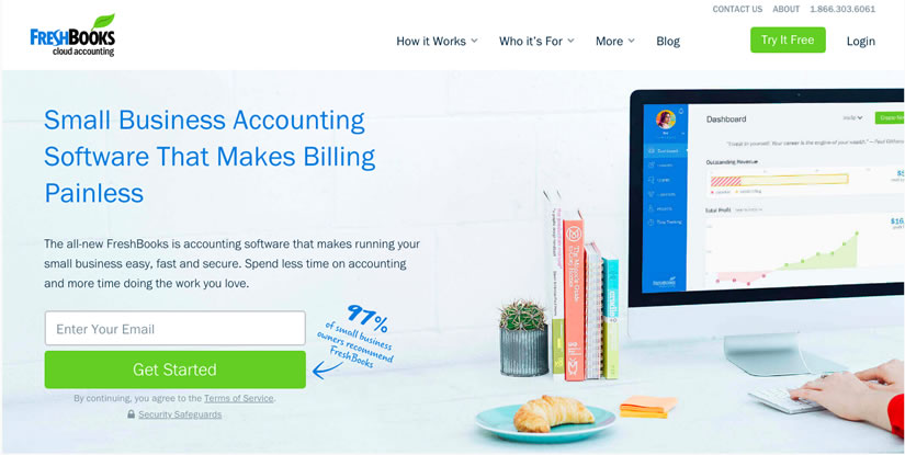
But Freshbooks changes it up a bit by adding a form to their home page, which encourages visitors to sign up and get started.
- Calls-to-action: When someone visits your website, they’re usually trying to take some sort of action. Sometimes, they know what that action is – like purchasing a subscription to the time tracking tool they’ve been eyeing for months or buying a present for a friend’s birthday. But other times, a visitor is just there to do research and doesn’t know what their next step will be.
This is where CTAs come in. It’s your job to guide people to the next step in their research or buying journey. You’ll want to create different CTAs that speak to different stages of the buyer’s journey.
What your CTAs encourage visitors to do next depends on where they are in their journey and what you want them to do next. Some CTAs will direct blog visitors to a related content offer, while others will encourage someone to request a demo, sign up for your newsletter or even create an account on your site.
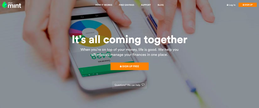
Let’s look at Mint. On their home page, they actually have two CTAs. The primary CTA, which is more prominent, encourages visitors to sign up for free. But Mint also recognizes a visitor might have some questions before signing up, which is why they have a secondary – and less noticeable – CTA below the primary one.
- Gated offers on landing pages: There’s some debate in the marketing world as to whether content offers should be behind a form. Ultimately, it depends on your goals and the type of content you’ve created.
Although every piece of premium content will be gated – like the case studies we mentioned earlier – many of your offers (especially your awareness-stage content) will be. And landing pages are one of the best lead generation tactics out there. The more landing pages you have, the more opportunities you have to convert your site visitors into leads.
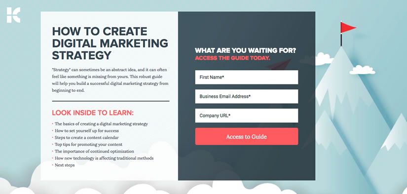
You’re probably already pretty familiar with landing pages, but if you want a quick refresher, check out this great example from Kuno Creative.
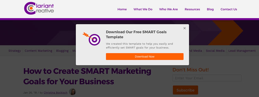
- Pop-up forms: I know, I know. Pop-ups are intrusive and annoying. But trust me when I say this: When done right, they don’t have to be.
Make sure your email pop-up forms offer something valuable and relevant so they add to a visitor’s experience rather than interrupt it. Also, time the appearance of pop-ups so they’re triggered by a specific action – like a visitor leaving your site or a certain time spent on page. And don’t forget to use language that’s actionable and human.
At Clariant Creative, we use pop-up forms on several of our blog posts, and we’ve seen great results from doing so. In the example below, we offer visitors the option to download a SMART goals template after reading a blog about creating SMART goals. The offer is relevant and valuable, and the pop-up is triggered when a person is ready to leave our site.
8. Follow SEO best practices
When redesigning or updating your website, you’ll spend a lot of time focusing on creating the best designs and writing engaging content – but don’t forget to also optimize your content for target keywords.
When optimizing your website, follow these SEO best practices:
Title tags
The title tag tells search engines what the page is about. Each page should have its own unique title tag that includes your target keyword along with your company name (if there’s enough room). Keep your title tags around 55-60 characters including spaces.
Meta descriptions
Google recently increased the length of meta descriptions to approximately 300 characters. Take advantage of this extra space by giving visitors a better idea of what they’ll learn from reading your content.
And for your main website pages (not blogs or content offers), think of your meta descriptions as a mini advertisement – an opportunity for you to give an elevator pitch of your brand, product or service.
Headers
Header tags – also known as an H1 tag – are like the subject line of your website page. You should use your keyword once in your H1 tag. If you have multiple sections on a single page, use H2 and H3 tags and incorporate keyword variations along with related keywords.
Body copy
Ultimately, it’s the content of your page that determines whether your page is worthy of a search result position. According to Moz, all good content has two attributes: it supplies a demand and is linkable.
- Good content supplies a demand: Your content should cater to your audience by addressing their pain points, answering their questions and giving them a solution to their problem. Great content solves a visitor’s problem and helps move them to the next stage of the buyer’s journey.
Your content should contain keywords but should do so naturally and should include relevant search terms. Forced keywords or keyword-stuffed content won’t help you rank. In fact, it’ll hurt you in the long run.
- Good content is linkable: Your content should be valuable, helpful, shareable, keyword-targeted, responsive and provide a great user experience for your audience. If it does all these things, people will want to link to it. But if people can’t link to it (because it doesn’t meet the criteria above), it’s very unlikely that search engines will rank your page.
Image alt tags
An alt tag is essentially a description of your image. Because search engines can’t “read” images or videos, adding alt text that includes your target keyword ensures your images are indexed.
Internal links
Internal links point to another page on your website. From an SEO perspective, adding internal links to other relevant pages or articles helps Google understand the value of your content and what content on your site is related.
And from a user experience perspective, internal links provide additional value to visitors, keep people on your site longer and can help lower your bounce rate.
Build backlinks
Backlinks – also known as inbound links – are an important factor that influences page ran. Here are some ways to get more backlinks:
- Reach out to a blogger in a related field and ask if they’d be interested in a guest post from you
- Reach out to an influencer and ask them to link back to your article
- Reach out to an industry publication to pitch an article idea to be interviewed for
- Share a snippet of your blog on industry forums and link back to your site (just don’t be spammy about it, okay?)
Identify broken links
Broken links can have a negative impact on your site’s SEO and usability. Broken links restrict the flow of link equity, which negatively impacts rankings. Additionally, they make for a bad user experience. For example, if a visitor clicks on a link and ends up with a 404 error, they may get frustrated, leave your site and never come back.
To avoid these pitfalls, periodically check your site for broken links. There are several tools you can use to identify broken links including Google Analytics and Screaming Frog. Once you’ve identified the broken links, either remove these links or direct visitors to a live page on your site.
9. Track your website analytics regularly
Don’t rely on your gut to tell you what’s working and what’s not. It’s important you take time every month and quarter to review your website data, identify wins and determine where you can improve moving forward.
Look at website performance metrics such as overall traffic, traffic sources, engagement metrics (bounce rate, time on page), pages per session, conversion rates, leads generated, top pages (most visited, highest converting), exit pages and new vs. returning visitors.
You’ll also want to look at your blog performance including how many posts were published each month, traffic to these posts, inbound links, keyword rankings and conversion rates.
Other metrics you may want to measure include:
- Email open and clickthrough rates
- Landing pages published each month
- Landing page conversion rates
- Campaign performance
- Lead generation (leads generated per month, top sources)
- Lead nurturing (marketing qualified leads, sales qualified leads)
- Social media performance
As you’re reviewing the data, look for opportunities for improvement, whether it’s increasing traffic to your site, improving landing page conversion rates, increasing time on site, lowering your bounce rate or something else altogether. But don’t just say you’re going to make these changes. Set actionable goals, develop a plan for making these improvements and every month, see how you’re progressing.
Tip: If your goal is to increase traffic to your website, focus on channels you can control like email, social media and paid ads (PPC and paid social ads).
10. Improve the user experience on key pages
When a visitor comes to your website, your hope is they like the page they’re reading so much that they stay and visit more site pages. But sometimes, this doesn’t happen and they leave after only viewing one page.
If your website has a ton of website traffic and a high bounce rate, it could be due to a poor user experience. When reviewing your analytics, identify pages with a bounce rate over 50%. Then, start brainstorming ways you can improve the user experience or content on those pages so users spend more time on your site.
Some ways to lower the bounce rate include:
- Adding more internal links to relevant content
- Linking to relevant content offers on product or services pages
- Including links to popular or relevant posts on your blog
- Improving your content to ensure it provides value and answers questions
- Removing unnecessary (and intrusive) pop-ups
There you have it – 10 best practices for lead generation websites. These are by no means the only website best practices out there for lead generation, user experience and SEO. However, if you follow the tips above, you’ll create a website that speaks to your ideal buyer, helps them solve real problems and in turn, generates more leads for your business.
Now that your website is a lead generation machine, you’ll need a way to analyze all the data. Download our free monthly and quarterly Marketing Report Templates and easily track the metrics that matter most so you can prove your marketing ROI.