Anatomy of Great Call-to-Action Examples

If you’ve been paying attention, by now you understand that call-to-actions (CTAs) are an integral part of the inbound marketing funnel and ultimately, converting prospects into customers.
But how do you get potential customers to click and engage? In other words, what makes a great CTA?
It’s not as difficult as it may seem. In fact, if you break it down, there are just three components to a great CTA: Effective design, convincing copy and proper placement.
Let’s take a look at these components, along with a few great call-to-action examples.
Effective CTA design
When designing your CTAs, the best rule of thumb is to keep it simple! Make sure the offer is clear to the user by using straight-forward text and an actual button for the CTA. The button provides the visual cue to the user that this is where they’re supposed to click.
Consider using contrasting colors and images that don’t blend in with the rest of your site so that your CTA stands out. Experiment with different font-faces or styles (for example, using bold text or all CAPS), the use of arrows or bright, action-invoking colors such as red, orange or yellow.
In this example from Bluehost, most of the site is monochromatic blue and white so the green button really grabs your attention:

The copy is convincing too, since it points out the savings that can be had and creates a sense of urgency by suggesting you “get started now” (more on that later).
Try using photos of people to humanize your message, especially if your CTA involves customer service. People like to know that they’re going to talk to an actual person when they reach out to contact your company.
Note that in the Bluehost example above, the girl in the photo is looking at the offer text, giving you another visual cue as to where you should direct your attention.
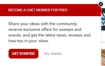
For pop-up CTAs, make the button more attractive to click on than the link to dismiss the offer, such as in this example on CNET.com:
Convincing CTA copy
One of the best ways to convince a visitor to click on your CTA is through the use of benefit-driven headlines. In other words, think about your target customers’ needs or pain points, what you can do to solve them and how you can get this point across.
For example, in this CTA on QuickSprout (a blog about driving more website traffic), they use a powerful testimonial about explosive pageview growth, not to mention a photo of an actual person running a successful business:

Kind of makes you want to learn more, huh?
Play on emotions and make potential customers feel more connected to your offer by using first-person copy in your CTAs, such as “Send me my free kit” or “Sign me up”.
Persuasive action verbs such as try, find, start, discover or download are smart choices for CTA button text as well as benefit words such as new or free. You can also create urgency by using phrases such as “Try it now”, “Try it free for 30 days” or “While supplies last”.
Related Content: What Is Contextual Marketing and Can It Help My Website?
Use copy that demonstrates the cost savings that can be taken advantage of, or try throwing in something for free in return for something else (“Subscribe now and download this free ebook!”). After all, everyone loves a freebie.
Another successful tactic is the use of two CTA buttons underneath an offer. In the example below, Salesforce not only creates urgency by suggesting you sign up for this “limited time offer” by August 31, but they also give you two choices, making it more tempting to click on at least one of them:
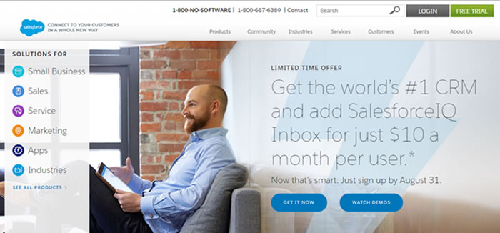
This persuasive copy points out that it’s “the world’s #1 CRM”, and even tells you how smart you are for taking advantage of this offer. Who doesn’t want to feel smart?
Proper CTA placement
Aside from the home page, where’s the best place to put your CTAs? The jury is out on this one. Some marketers claim that right-hand column placement of CTAs work best – especially on landing pages – while others will tell you they’ve had better luck with end-of-page CTAs.
This curiosity-sparking CTA by Neil Patel is located at the bottom of the right-hand column of his blog post, but stays in place as you continue reading and scrolling down the page. An always-visible CTA = brilliant!

Another important consideration about proper CTA placement is not only where on the page you should place an offer, but on which pages a particular offer should appear. In other words, make sure your CTAs are relevant to the page content where they’re placed.
For example, while reading a post on HubSpot about top email marketing tools, this CTA popped up on my screen:
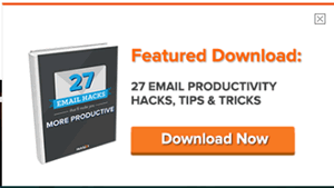
There’s a pretty good chance I’m going to click on this offer since it’s directly related to the topic of the content I was just reading about.
If you’re going to use pop-up CTAs, try delaying the pop-up based on the amount of time spent on the page or whether the user has scrolled at least halfway down the page. You don’t want to turn off your visitors by blasting them with pop-ups as soon as they navigate to your webpage.
Test and test some more
While these are some proven methods and examples of CTAs that work, the bottom line is that you have to find out what works for you and your business. Use A/B tests on different designs, copy and placement and then measure your results. Keep tweaking as you go until you find your golden egg CTA.
When you're ready to start measuring your results, you'll need a way to pull all of your data together. Download our free Marketing Reporting Toolkit for access to the same monthly and quarterly reports we share with our clients to prove the ROI of everything we do!


