10 Call-to-Action Examples You’ll Actually Want to Click
If you build it, they will come. But will they know what to do when they get there?
Your website is intuitive and well-designed, populated with engaging content arranged in an attractive layout. Your products and services have been user-tested and quality controlled, and you’re confident you’re offering the very best. You’ve thought of everything – from your brand's aesthetics to its authenticity. But will all these qualities drive conversions? How do you convert all this excellent potential into downloads, sign-ups and new business?
You create a call-to-action.
What is a call-to-action?
A call-to-action, or CTA, is exactly what it sounds like: a direct call to your visitors or customers to take a specific action. The action you want people to take could be anything: download an e-book, sign up for a free trial, attend an event, make a purchase, etc.
What makes a great CTA?
It’s one thing to know what a call-to-action is, but it’s another to create one that prompts conversions. All great calls to action have a few common traits: They’re clear, compelling and direct.
Clear
It might seem like a no-brainer, but excellent CTAs should first and foremost be easy to spot. Rather than tucked away in a corner or hiding in a discrete link, your call-to-action should be one of the most obvious elements on your page. This is one of the reasons buttons make such a great format for calls to action: they’re eminently clickable and hard to miss!
Compelling
Being easily identifiable is only part of a successful call-to-action. In the span of a word or a phrase, this is your final bid to get someone to hand over their email address or their credit card info. You need to inspire them to act. Whatever tactic you choose – to prod, persuade, invite, amuse or excite – your call-to-action needs to grab and hold someone's attention. It's not enough to be engaging; you need to give someone enough motivation to take the final plunge.
Direct
While a call-to-action can be clever (or even funny), being practical is definitely more valuable than being poetic. A successful call-to-action will let a visitor to your site know exactly what you want them to do.
What are you hoping to accomplish with your CTA? Do you want users to sign up for your newsletter, subscribe to your service or buy your product? Whatever action you want a visitor to take, address it directly.
While these guidelines are helpful, sometimes you need to see a really excellent call-to-action to recognize the nuances of what masse it great. Here are 10 examples we think stand out and embody all the qualities that make a call-to-action work.
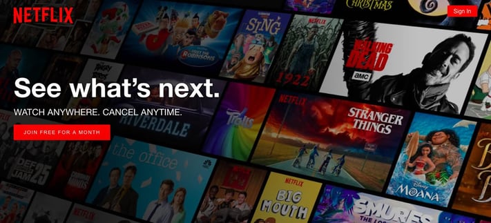
1. Netflix
Why we love it: In addition to making the desired outcome extremely clear, Netflix’s call-to-action makes signing up feel stress-free by reassuring a potential customer they won't be charged at this moment. This guarantee of a free trial defers the financial decision and makes it easier for a new user to take a risk and make a new account.
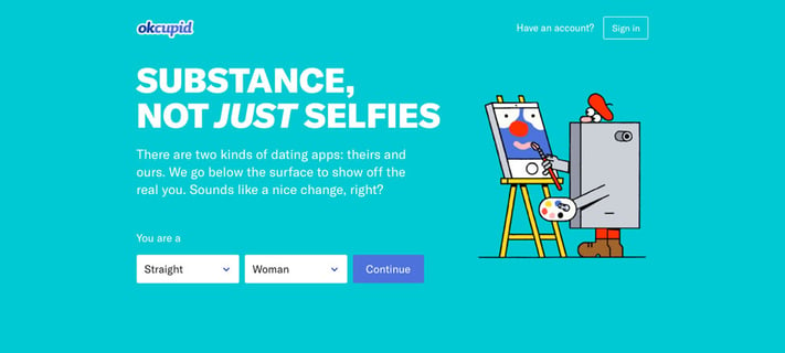
2. OkCupid
Why we love it: This call-to-action embodies confidence. The bold assertion of the quality of the site and clarity of the layout are huge assets. The call-to-action button is direct and positioned in a way that a visitor feels as though they’re already part of the way through the sign-up process when they click “continue.” And even though the text is mostly about OkCupid and what makes them different, the CTA itself is all about the visitor.
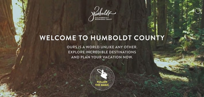
3. Humboldt County
Why we love it: Humboldt County’s website is stunning on its own: It greets you with a full-screen video full of beautiful footage of the forest and coast. But what we really love is the unconventional “follow the magic” call-to-action button placed at the bottom of the page, which falls right in line with the video’s Alice in Wonderland theme. It’s a clear, compelling CTA you just can’t miss.
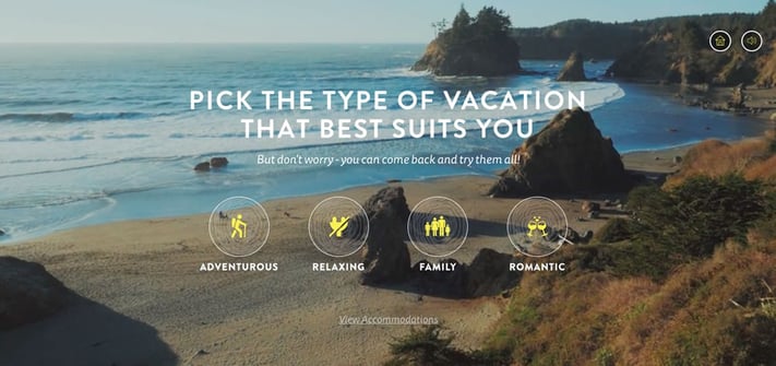
What’s more, once you click that CTA, you’re taken to a page that essentially lets you choose your own adventure when planning your vacation. Not only is this a fun call-to-action path for visitors but it encourages them to play around and spend more time on the site.
Related Content: Anatomy of Great Call-to-Action Examples
4. Asana
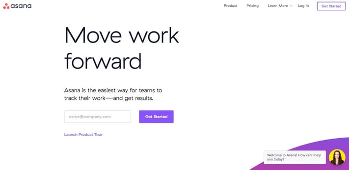
Why we love it: The call-to-action for this productivity app is perfectly aligned with its purpose and ethos. The focus on work, moving forward and making progress all give you a sense of momentum. The auto-fill prompt specifically designed for your work email is also a clear indication that this is an app for taking care of business and makes you feel productive from the moment you sign up.
5. OfficeVibe
Why we love it: Not all calls-to-action need to be full-screen images with large headlines. Sometimes, simpler is better. Slide-in CTAs, like this one from OfficeVibe, are an effective way to grab a user’s attention and encourage conversions. The copy is clear and direct, and you know exactly what you’re going to get when you sign up – expert leadership tips sent straight to your inbox.
6. Freshbooks
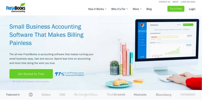
Why we love it: What makes this call-to-action great are the details and what is in the periphery. A bright, clear button that tells us we can “get started for free” is certainly enticing. However, is the fine print that's really effective here.
Instead of trapping us in additional obligations like fine print often does, this reassures us that a credit card is not required and canceling is easy. Fine print that works in your favor is a great way to nudge someone into making the all-important decision to take you up on that free trial.
7. HelloSign
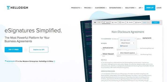
Why we love it: While simplicity and clarity are key, we like that this particular call-to-action gives a visitor options. Although the attractive blue button is clearly the star here, having the lower commitment option to explore the API and learn more about the internal workings of this electronic signature app are reassuring to someone who’s not quite ready to get started with a free trial.
8. Sprout Social
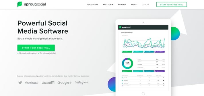
Why we love it: In this case, it's the combination of the inviting green button with the subtle drop shadow and the reassurances beneath it that make this call-to-action a winner.
Those little green checkmarks recall the confirmation marks we receive when successfully filling out an online form, which in turn makes the user feel like they’ve been pre-approved for this service. This subtle cue that the potential user is special – and that this offer is just for them – can be just inviting enough to encourage them to sign up for this service.
9. SnapApp
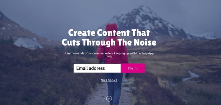
Why we love it: When you land on SnapApp’s homepage, you’re greeted by this call-to-action. Visually, it’s a beautiful CTA (that almost doesn’t feel like a CTA), but what we love the most is how it speaks to one of the biggest pain points of marketers, which is creating content that stands out from everything else out there. The copy is clear, and you know what you’re going to get when you enter your email address. But if you’re not interested, SnapApp makes it easy for you to opt-out by simply clicking “No Thanks.”
10. Trello
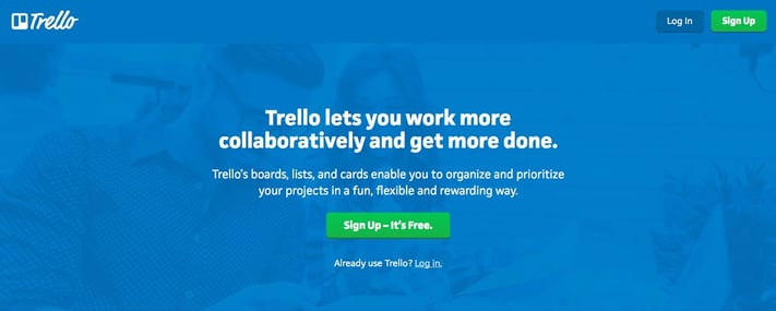
Why we love it: Trello does a great job balancing multiple call-to-action buttons on a single page. It’s clear their main goal is to get you to sign up for Trello, and they place two green CTA buttons on the page to encourage you to do so. But, they also know people who land on their home page may already have a Trello account, which is why they place a text CTA directly below their “sign up – it’s free” button. Even with multiple CTAs, they manage to keep the copy and design both clean and direct.
Making calls-to-action work for you
While these CTAs succeed for slightly different reasons, they all have several things in common: The intent is clear, they’re easy to spot, the copy is direct and they’re compelling enough to get visitors to take the next step.
When designing CTAs for your business, keep these qualities in mind, but don’t forget to authentically represent your brand identity with a voice that speaks to your buyer personas. By doing this, you’ll be well on your way to creating CTAs that encourage clicks and conversions.
If you're ready to start measuring your clicks and conversions, you'll need a great reporting tool to organize your data. Download our free Marketing Reporting Toolkit for the same monthly and quarterly reports we use with our clients to showcase the ROI of everything we do!


