7 Advanced Strategies for More Effective Landing Pages

When you read strategies for creating effective landing pages that convert well, you often hear the basics: Keep your form short, add a call-to-action (CTA), remove navigation, keep the design simple – the list goes on.
And while this is great when you’re just getting started, what happens when you’re ready to take a deeper dive into increasing conversions?
Here, we list out seven advanced strategies that will help you generate more leads and take your landing pages to the next level.
1. Strengthen the headline
You already know the headline is one of the most important elements of your landing page. It’s the first thing a visitor sees when they end up on your landing page – so make it grab the reader right away.
How do you write a stronger headline?
- Make it shorter. Headline real estate is incredibly valuable, so choose every word carefully. If a word doesn’t make the headline better, take it out.
- Make it actionable. You want to connect with the reader in a crystal clear way. If the reader has to stop and think, you’ve lost your moment.
- Make a promise. Your visitor has a pain point, so show how you solve it. Paint a picture of what success looks like and make your visitor crave your solution.
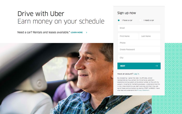
Take this landing page from Uber, for example. The headline is short – just a three-word main headline and five-word subhead. It’s clear – the reader knows immediately what Uber wants him to do. And it highlights something the reader definitely wants: to make money easily.
2. Simplify the copy
While a great headline is a good start, your copy needs to be just as powerful. But too often, marketers equate “powerful” with “long.” The trick with effective landing page copy is to dig into your most important features and benefits – while simultaneously keeping the copy effortless to read.
After all, you only have about 20 seconds to build so much interest the reader is more than happy to give you his email address in exchange for whatever content you have behind the gate.
For landing page copy that converts:
- Use fewer words. Like your headline, keep the copy short. Do you need full sentences and paragraphs when just a series of bullet points will do? Look for every opportunity to trim back the copy without impacting your message.
- Be conversational. Read your copy out loud. Does it reflect how people really talk? Shorter words and simpler sentences are almost always a better choice for landing pages. Ironically, the more complex the copy you write, the less confident you sound to the reader.
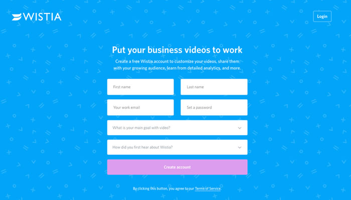
Wistia gets it. In the example below, they’ve streamlined their copy to the point where a single sentence is all they need to convince the reader to sign up for a free account.
If copy this short makes you nervous, it’s worth noting Wistia does have additional copy below the form that addresses frequently asked questions. But above the fold, they keep it simple and to the point.
3. Question the form placement
As inbound marketers, we’re conditioned to put landing page forms on the right side of the page and above the fold. But in web content, the fold isn’t an absolute line and will vary based on the size of the visitor’s screen.
By far, placing the form above the fold is the norm. But numerous studies suggest that a majority of web users scroll, and a significant portion of users begin scrolling before a page has even finished loading.
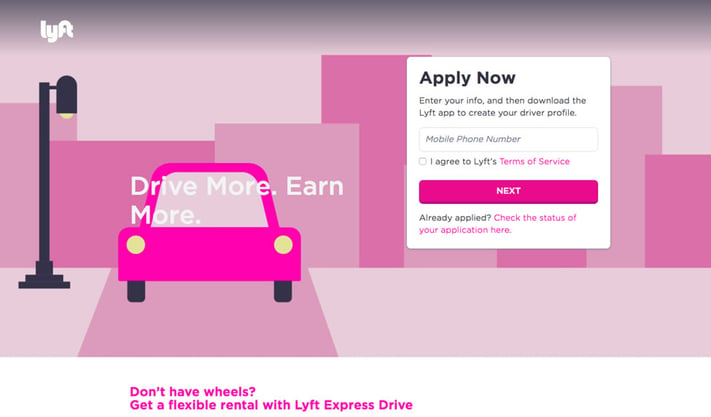
So, what does this mean for your landing page form? Should you always put it above the fold like Lyft?
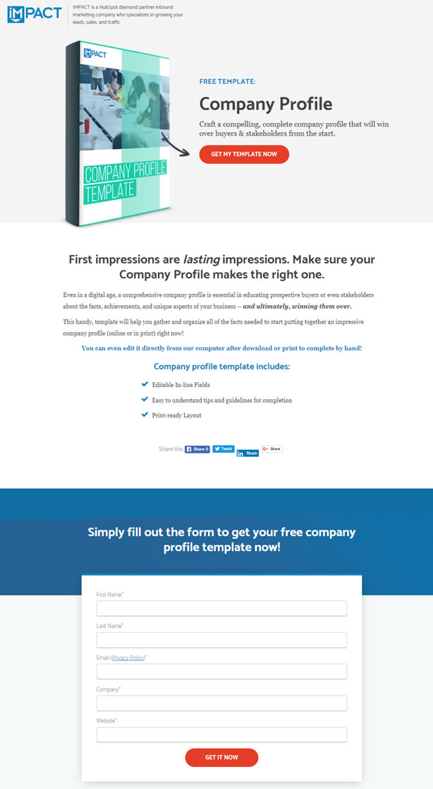
Or should you explore putting the form below the fold like IMPACT?
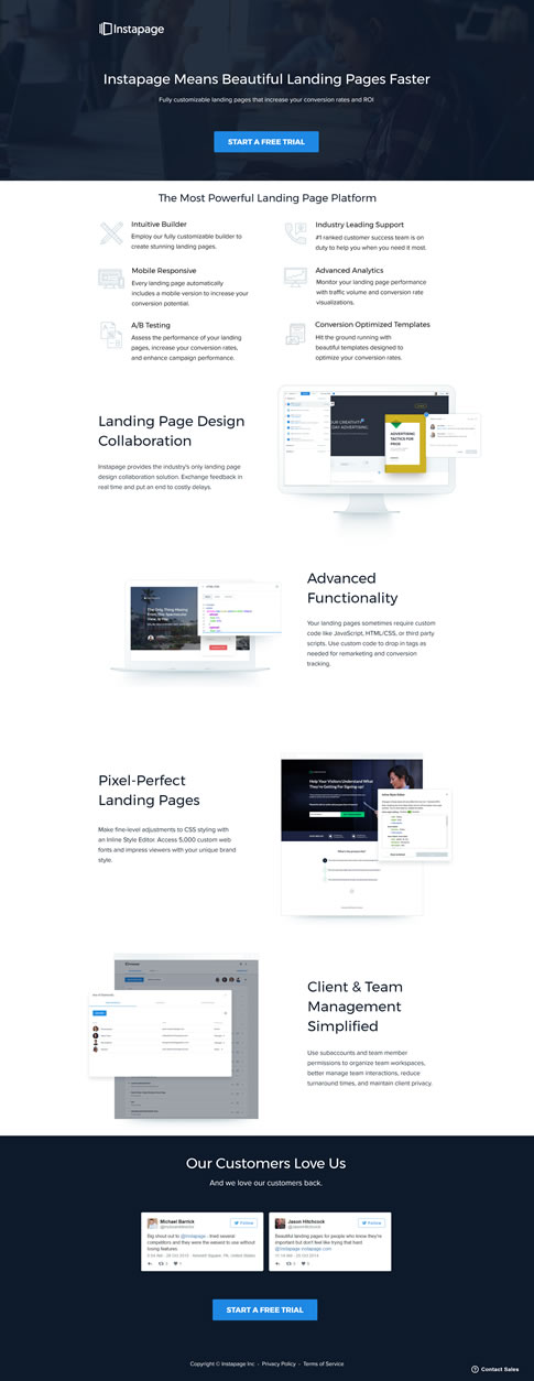
Or what about a two-step opt-in process like Instapage? In this (counterintuitively long) landing page, rather than fill out a form directly on the page, the visitor clicks the “Start a Free Trial” button to take the next step.
Turns out your form placement will depend on the solution you’re offering and what you want the visitor to do.
For example, if you’re selling something complex (like life insurance) or if you’re making a big ask (like scheduling a consultation), placing your form above the fold might be premature. Instead, you may want to agitate your visitor’s pain points or dig deeper into the benefits of your solution before you throw a form at the visitor.
On the other hand, if either your solution or your ask are more straightforward (such as downloading a free white paper), you have more leeway with where you place your form.
Ultimately, A/B testing is your best bet to learn unequivocally which approach converts better for you.
4. Add video
Video is insanely hot right now. Why? Ninety-five percent of viewers retain messages in videos, and adding video to a landing page increases conversions by 80 percent.
Video works because it increases the amount of time the visitor is on your page. It's also a powerful tool to immerse the visitor into your solution and build credibility and trust.
But implementing video well requires finesse. Best practices include:
- Use the right thumbnail. The start screen must be so compelling the visitor is compelled to click.
- Keep your video above the fold. Although you might decide to place your form further down on the page, your video should be unmissable.
- Make your video worth the view. No one likes wasting even a few minutes of their day on content that doesn’t teach them something or make their life easier. If you’re going through the hassle of creating a video, keep that visitor firmly in mind and deliver the value the visitor needs.
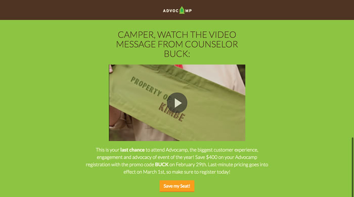
- Add text. Accentuate key takeaways with text overlays, like the great example below from Advocamp. You might also consider adding captions to the video, as a nod to the visitor who might be sitting in an office cubicle and wants to watch your video with the sound muted.
Click on the image to view the video.
5. Add visual cues
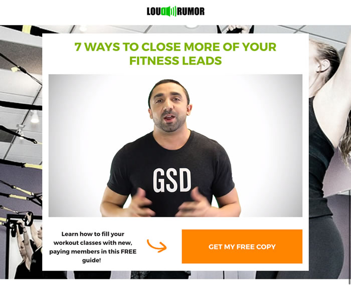
Although a visitor may initially be drawn to a great headline, you may want to emphasize a key feature or call to action. Directional cues, such as arrows, pointing, lines, encapsulation, color and object positioning, show the visitor where to focus.
This example from Loud Rumor uses a simple but effective arrow to guide the visitor’s eye to the CTA button.
6. Be more strategic with colors and shapes
Colors and shapes are more than just decoration. Different colors elicit different feelings from your visitors. These graphical elements can also highlight key areas by creating a stark contrast with other elements on the page.
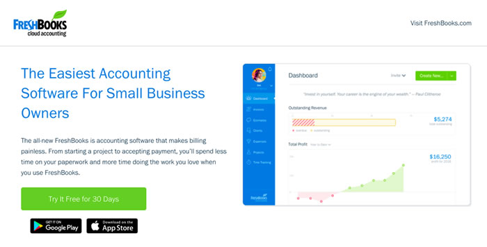
Take this landing page from Freshbooks. Notice how the green CTA grabs your attention and stands out among the blue text and graphics?
Shapes matter too. In most cases, buttons with rounded corners convert better than those with sharp corners, because rounded corners are easier for the eyes and brain to process and because humans see sharp corners as threatening.
7. Make one last effort with an exit-intent pop-up
There’s much debate among inbound marketers about whether exit pop-ups actually drive conversions or simply annoy visitors. However, that the debate even exists suggests you might want to test whether pop-ups can improve conversions on your page.
Related Content: Email Capture Pop-ups: How to Make Them Less Annoying, More Effective
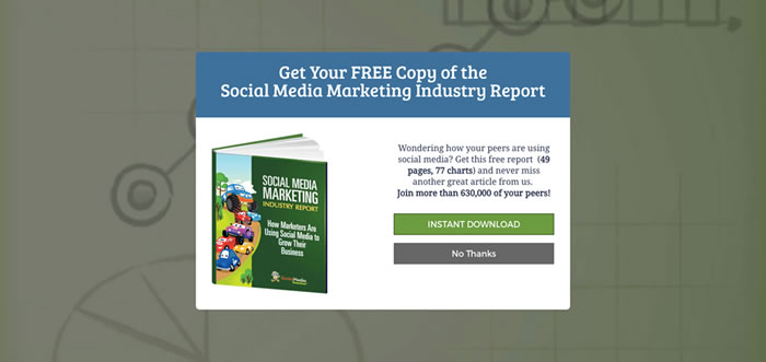
The point of an exit pop-up is to grab the visitor’s attention just as the visitor is about to leave and click away from site. When creating the pop-up, keep the offer tightly relevant to the initial landing page offer, but try providing an additional benefit that might sway the visitor into converting. And keep the form short: Name and email is plenty.
It’s hard to get visitors to your landing page, and it’s even harder to make them stay long enough to convert.
But these advanced strategies can help you build more effective landing pages that skyrocket your conversions. Of course, best practices work differently for every business, so it’s up to you to discover which will work best for yours.
Use these strategies as a guideline and test tactics on your own landing pages. With the right approach backed by the right data, you’ll be on your way to a whole new level of performance.
Learn how to boost conversions and measure your marketing ROI by downloading our free e-book, Six Marketing Metrics You Can’t Afford to Ignore.


